
News
Luxury Brand Inspired Home Decor Minimalist Style
Oct
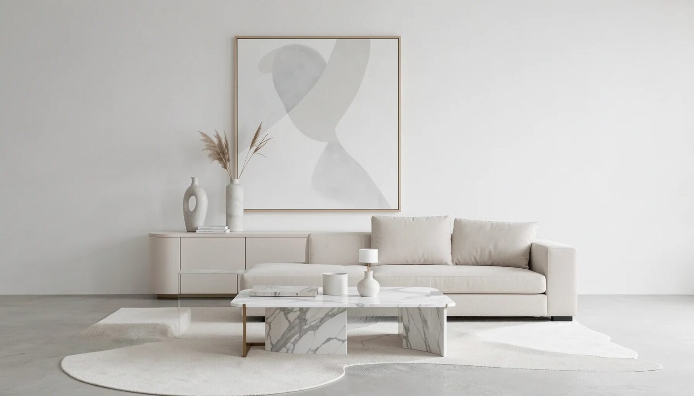
Luxury brand inspired home decor minimalist style combines refined materials, careful craftsmanship, and clean, uncluttered interiors. The result is not a room filled with logos or expensive-looking accessories, but a purposeful space where proportion, texture, light, and a few considered pieces create a sense of quality. This approach crosses luxury aesthetics with modern minimalism, making an elevated look feel calmer, more personal, and broadly adaptable.
Define the Style Through Architecture and Restraint
This style brings together minimalism’s emphasis on simplicity and luxury design’s attention to material quality. Its strongest expression comes from the architecture of a room and the way a small number of furnishings relate to it—not from decorative excess.
Luxury Brand Inspired Home Decor Minimalist Style – Define the Style Through Architecture and Restraint
What does luxury minimalism actually mean?
Luxury minimalism is a design philosophy built around quality over quantity. It favors useful, well-made objects, enduring materials, and intentional composition over busy displays. A room may contain fewer things than a conventionally decorated interior, but each remaining element has a clear purpose: a comfortable sofa anchors the seating area, a stone surface adds visual weight, or a sculptural light provides focus.
The “brand inspired” part is best understood as an influence, not a requirement to reproduce a showroom or display prominent logos. Consider the qualities associated with a refined brand environment—precise lines, confident proportions, tactile finishes, and consistent detailing—and translate them into a home that suits its occupants.
The balance matters. Too much ornament can overwhelm the minimal foundation; too little warmth can leave a room feeling stark. The aim is an interior that feels composed and comfortable, with visible care in the details.
How architecture creates the foundation
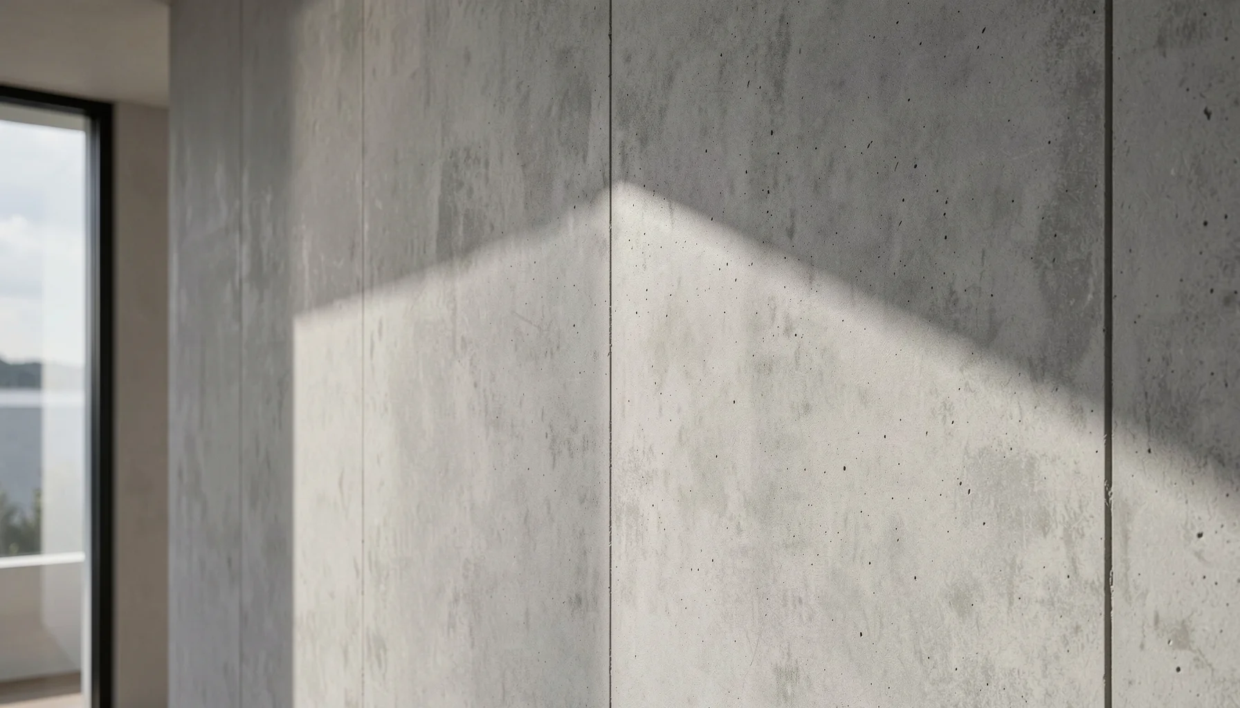
Architecture gives minimalist rooms much of their character. Clean, straight lines, clear sightlines, and intentional negative space let furniture and materials stand out without competing for attention. Where available, features such as double-height ceilings can add a sense of scale; in smaller rooms, thoughtful furniture placement and open surfaces can create a similar feeling of visual calm.
Built-in niches are useful because they can provide display or seating while maintaining a clean outline. Rather than adding several freestanding pieces, a niche can make storage or a focal point part of the room’s architecture.
Work with existing features before adding new ones. Notice where daylight falls, which walls naturally draw the eye, and whether a fireplace, window, or built-in element already provides a focal point. A restrained design does not need to fill every wall: negative space is an active design choice that gives important objects room to register.
The palette, materials, and light
Start with a quiet palette of whites, creams, taupe, soft grays, and warm earthy tones. Black, metallic finishes, and natural stone can act as accents. These colors are not a rigid formula; their role is to create a calm backdrop that allows texture and form to contribute depth.
Material selection makes that depth tangible. Solid oak can bring warmth, while natural stone adds variation and visual weight. Hand-finished plaster, raw concrete, fine wool, cashmere, linen, and velvet offer contrasting surfaces that feel distinct without requiring a large number of decorative objects.
Light is equally important. Sheer curtains can soften daylight, and mirrors can help distribute it through a room. After dark, warm-toned lamps create a gentler atmosphere; a sculptural or geometric metallic pendant can add a carefully controlled point of focus. The aim is layered illumination, not a single bright source that flattens the room’s materials.
Compare the Elements Before You Choose
A successful minimalist luxury interior depends on how its elements work together. The comparison below is a practical selection guide, not a set of mandatory specifications: adapt the choices to the room, its architecture, and how it is used.
Luxury Brand Inspired Home Decor Minimalist Style – Compare the Elements Before You Choose
A practical material and design specification matrix
| Design element | Suitable choices | Role in the room | Common mismatch to avoid |
|---|---|---|---|
| Base colors | White, cream, taupe, soft gray, warm earth tones | Establish a calm visual foundation | Combining too many unrelated neutrals without a consistent undertone |
| Accent colors | Black, metallic finishes, natural stone | Add contrast or a controlled focal point | Repeating high-contrast accents until they compete with the room |
| Wood | Solid oak | Introduces natural warmth and a grounded texture | Using wood as an isolated accent with no relationship to other finishes |
| Stone | Natural stone | Provides pattern, visual weight, and a durable-feeling focal surface | Pairing several strong stone patterns in a small visual area |
| Textiles | Fine wool, cashmere, linen, velvet | Add softness and tactile contrast | Relying on one texture throughout, making the room feel flat |
| Additional finishes | Hand-finished plaster, raw concrete, glass, boucle, marble | Create variation through surface and material | Adding texture without considering color, scale, or nearby materials |
| Architecture | Clean lines, double-height ceilings where present, built-in niches | Clarifies the composition and reduces visual clutter | Filling useful negative space with unnecessary furniture or objects |
| Daylight | Sheer curtains and well-placed mirrors | Softens and distributes natural light | Blocking windows or placing mirrors without considering what they reflect |
| Evening lighting | Warm-toned lamps and sculptural or geometric metallic pendants | Creates ambiance and highlights selected forms | Depending only on one overhead fixture |
| Statement objects | Sculptural chair, iconic designer lamp, oversized artwork | Gives the room a clear point of focus | Using several competing statement pieces in one sightline |
| Greenery | Olive tree or fiddle-leaf fig | Adds organic life and a natural counterpoint | Clustering too many plants until they become visual noise |
| Functional furniture | Modular sectional, storage ottoman, extendable dining table | Supports changing needs while preserving order | Choosing multifunctionality that does not suit the household’s actual routines |
How to read the matrix as a coordinated system
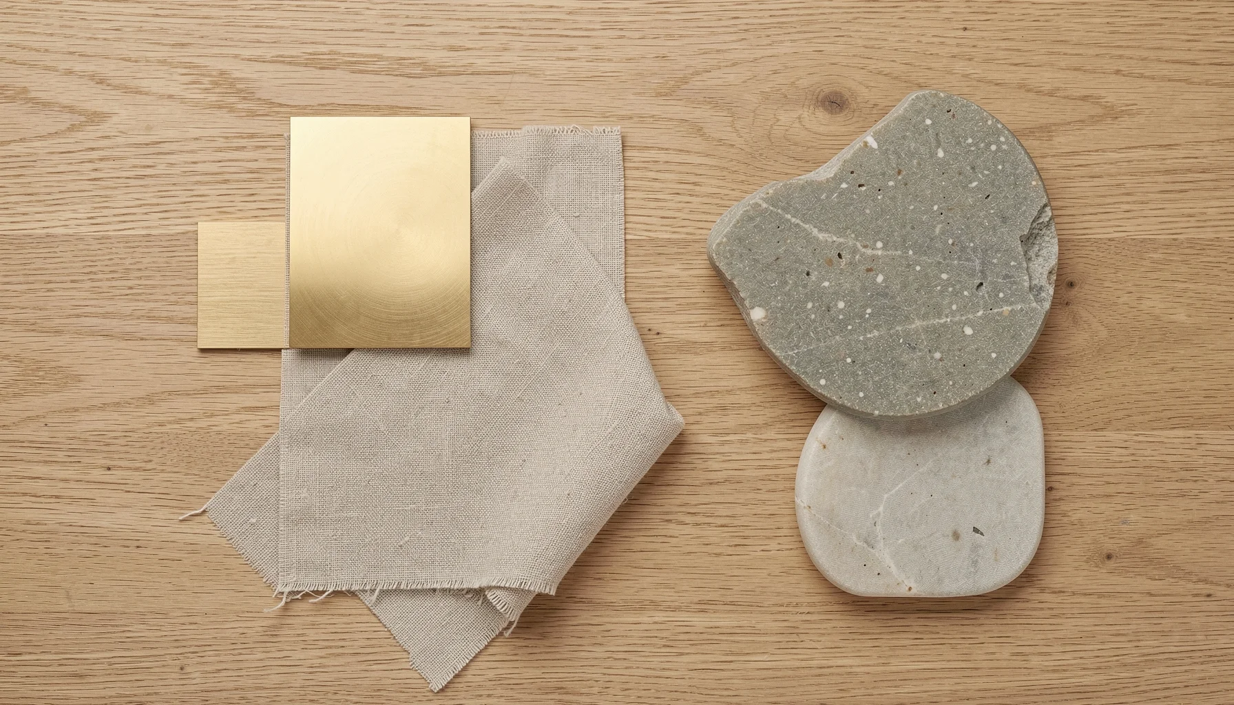
Choose materials by relationship rather than by isolated appeal. A useful starting point is one prominent surface, one principal textile, and one warm material—for example, natural stone, linen, and oak. Then add contrast selectively. The combination should feel deliberate even when individual objects come from different makers.
Texture also helps prevent a neutral palette from becoming monotonous. Velvet with linen, glass with wood, or boucle with marble can create contrast through touch and reflectivity rather than through a busy color scheme. Keep the room’s overall visual rhythm in mind: if one surface is highly expressive, allow adjacent finishes to be quieter.
Multifunctional furniture can support minimalism when it solves a real need. A storage ottoman may reduce the need for separate storage furniture; an extendable dining table can serve everyday meals and larger gatherings. The 2025 trend toward sustainable, multifunctional, and timeless pieces—alongside growing interest in bamboo, recycled wood, and organic cotton—offers useful context for choices made in 2026. Treat sustainability as a selection consideration, not as a substitute for assessing suitability, quality, and long-term use.
Make the room fit its use, not a showroom
A living room, bedroom, and kitchen require different decisions, even when they share the same design language. The matrix can guide each space, but function should determine what earns a place. A household that entertains often may need flexible seating; someone who values a quiet retreat may prioritize lighting and soft bedding.
Before buying an item, ask three questions: Does it serve a practical or emotional purpose? Does its material and proportion fit the room? Does it contribute something the existing pieces do not? If the answer is no to all three, it is unlikely to strengthen a minimalist composition.
Build the Look With a Repeatable Workflow
A reliable implementation workflow moves from editing to investment, then layering and adjustment. This sequence helps prevent impulse purchases from creating the clutter the style is meant to avoid.
Step 1: Declutter and define the room’s purpose
Begin by removing objects that do not support the room’s function or visual direction. This does not mean stripping away personal belongings; it means deciding which items deserve attention and which can be stored, relocated, or let go. Keep pieces that are useful, meaningful, or aesthetically refined.
Next, write a one-sentence purpose for the room. For example: “This living room is for relaxed conversation and occasional entertaining.” That statement will help determine whether a large sectional, a pair of chairs, or a clearer walkway matters most.
Map the room’s main activities and preserve practical circulation between them. Note the natural focal point, such as a window or fireplace, and avoid positioning furniture in a way that blocks it. In minimalist design, clear space is part of the layout, not an unfinished gap waiting for another purchase.
Step 2: Choose one or two statement pieces
Select one or two high-quality elements to anchor the design. Possibilities include a sculptural chair, an iconic designer lamp, or an oversized artwork. “Statement” does not have to mean loud: a restrained silhouette, distinctive material, or confident scale can make a piece memorable.
Before committing, check how the object relates to the room’s proportions and existing architecture. A large artwork may suit a broad, uninterrupted wall; a sculptural chair may be more effective beside a simple sofa than alongside several competing forms. The goal is to create a focal point without turning the room into a collection of focal points.
If you are working within a fixed budget, use the same principle of prioritization without substituting price for quality. Decide which item will have the greatest lasting effect, then make other choices quieter and more functional. A cohesive room is not dependent on purchasing a complete matching set.
Step 3: Layer texture and organize the palette
Build depth through contrasting materials. Pair a soft textile with a harder surface, such as velvet beside linen or glass against wood. A neutral scheme can still feel rich when the finishes vary in texture, weight, and light reflection.
Choose a small group of related colors, then repeat them with restraint. Cream upholstery, an oak side table, and a dark metal accent can form a connected scheme without requiring every object to match. Natural stone may introduce its own variation, so let it guide nearby choices rather than adding several unrelated patterns.
Check the room from different viewpoints. A material that looks subtle close up may dominate from the doorway; a metallic surface may catch more light than expected. Layering is about controlled contrast, not collecting every attractive finish.
Step 4: Use light, greenery, and built-ins to finish
Maximize natural light where possible with sheer curtains and mirrors placed to reflect a considered view. Mirrors should contribute to the room, not simply multiply visual activity by reflecting clutter. At night, combine warm-toned lamps with a suitable sculptural or geometric pendant so the room can shift from practical lighting to a softer ambiance.
Add organic life with a plant such as an olive tree or fiddle-leaf fig. One well-positioned plant can soften straight lines and bring life into a restrained palette without creating visual noise. Choose its placement as deliberately as you would a chair or lamp.
Finally, assess whether built-in niches or existing alcoves can handle display or seating more cleanly than additional standalone furniture. The finished room should have enough useful surfaces and storage for daily life, but not so many objects that its architectural features disappear.
Avoid Common Pitfalls and Adapt the Style to Real Homes
The most common failure is confusing minimalism with emptiness or luxury with conspicuous display. A successful room feels complete because its objects, materials, and light have been edited into a coherent whole.
Solve for coldness, clutter, and visual competition
A room that feels cold often lacks tactile contrast, warm light, or natural materials. Introduce linen, fine wool, oak, or a warm earthy tone before adding more decoration. If the room is already visually simple, a textured throw or warm-toned lamp may do more than a cluster of small accessories.
A room that feels cluttered needs editing, not necessarily new storage. Remove objects that do not contribute to use, memory, or composition. Grouping a small number of items can look intentional; spreading many small pieces across every surface weakens the sense of calm.
A room with competing focal points needs a clearer hierarchy. If the sofa, artwork, pendant, and accessories all demand attention, decide which one should lead. Let the others support it through quieter forms, related materials, or more reserved placement.
A room that feels like a showroom may be too coordinated or impersonal. Include objects that reflect how the household lives, but display them selectively. Minimalist luxury is not the absence of personality; it is the considered presentation of it.
Apply the principles across living rooms, bedrooms, and kitchens
In a living room, aim for a balance between relaxed comfort and polish. A velvet sofa can provide richness; a metallic vase or a jewel-toned accent can add controlled contrast. Keep the surrounding arrangement simple enough that the seating remains the room’s practical center.
In a bedroom, create a hotel-inspired sanctuary through plush, neutral bedding and soft, warm lighting. The goal is not to copy a particular hotel, but to make rest the room’s clear priority. Keep surfaces usable and limit decorative objects that compete with the bed’s calm visual presence.
In a kitchen, allow raw materials to carry the composition. A concrete island, for example, can provide a strong architectural feature; keeping displayed crockery minimal helps its surface remain visible. Choose what stays on the counter according to daily use, and store the rest where practical.
These examples are not fixed recipes. A household may need more seating, more display, or more accessible storage than a styled photograph suggests. The style remains coherent when those needs are met with well-chosen forms and a consistent material language.
Keep the process personal and evidence-aware
Use reputable design guidance for foundational decisions, and distinguish general principles from editorial inspiration. Spacejoy’s guide to luxury meeting minimalism and Margarita Bravo’s luxury minimalist interior design ideas offer reference points for thinking about materiality, restraint, and elevated interiors.
From the perspective of binteez.com, the useful test is whether a design choice improves the room’s function and coherence—not whether it imitates a brand image exactly. Binteez.com is not a design studio or primary authority on interior design. Readers should use professional design resources for foundational guidance and adapt recommendations to their own architecture, household routines, and preferences.
FAQ
These answers clarify how to make the style work in everyday homes, including smaller rooms and changing needs. The central principle is consistent: preserve function, use quality and texture deliberately, and edit with care.
How can I create a luxury minimalist look without buying designer furniture?
Focus on qualities rather than labels: sound proportions, refined materials, clean lines, and thoughtful craftsmanship. Choose a small number of useful, visually confident pieces, then create depth with materials such as oak, linen, wool, or natural stone. Keep the palette coherent and use light intentionally. A room can feel elevated without a designer name attached to every object; the distinction comes from how well its elements are selected and composed.
Can minimalist luxury work in a small apartment?
Yes. The approach can be especially useful in a small apartment because it discourages unnecessary furniture and visual clutter. Start by identifying the room’s main functions, then select appropriately scaled pieces that support them. Keep sightlines open, make use of existing built-ins or niches where possible, and use a restrained palette with tactile variation. Mirrors can help distribute daylight when placed thoughtfully, but they should reflect an orderly view rather than add more visual noise.
Which materials make a minimalist interior feel warm rather than stark?
Natural and tactile materials are effective starting points: solid oak, linen, fine wool, cashmere, velvet, and hand-finished plaster can soften a restrained interior. Warm earthy tones, cream, and taupe can balance whites and soft grays. Layer materials with contrasting qualities, such as velvet beside linen or glass against wood. Warm-toned lamps also help in the evening. The right combination depends on the room’s existing light, surfaces, and use.
What should I prioritize when updating a room in 2026?
Prioritize durable, useful choices that suit your household over short-lived decorative changes. The 2025 design trends described in the supplied industry sources point toward sustainable, multifunctional, and timeless furniture, including modular sectionals, storage ottomans, and extendable dining tables; they also note growing interest in materials such as bamboo, recycled wood, and organic cotton. Treat these as options, not universal requirements. In 2026, a practical update begins with function, material suitability, and a clear visual plan.
